
What we did :
UX Design
User Testing
Visual design
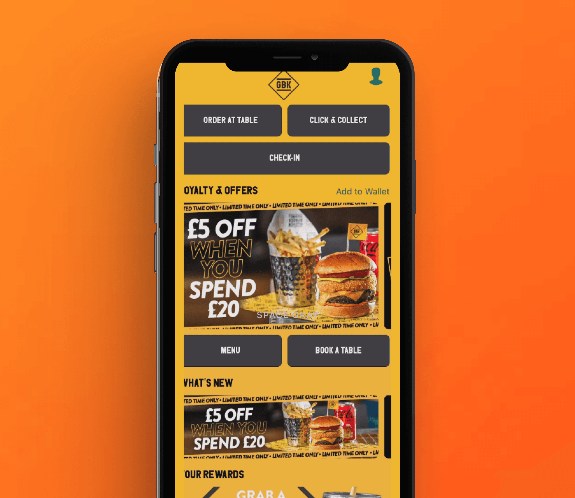
Hospitality Apps
Securing a long term contract worth half a million with itsu by designing a winning Proof of Concept in 48 hours
Industry :
Hospitality
Duration :
2 Months
The Problem
Launching the MVP of our web app (back in 2020) in a hurry came at a price. The UX consisted of a number of pain points on both web and order to table app:
Issues with diners ordering to the wrong location (but the correct table)
Painfully long check out process, too many screens to go through
Long loading speeds and time outs
Outdated UI
Unhelpful errors
Asking users to add a credit card before they can even browse the menu
No split the bill capabilities
Effected merchants:

Team
1 Designer (me)CPO
1 Product Owner
1 IOS Developer
1 Android Developer
2 Platform Engineers
Research
Speaking with merchants directly (ie. 'Head office' of Peach pubs) to understand pain points
In-customer/end-user visits, visiting around 32 customer venues around the UK
Competitor venues visits: how were they dealing with the same challenges?
Fleshing out all our existing task flows, this allowed us to see just how 'tap heavy' our UX really was
Remote User testing; split testing our solution with our competitors using the System Usability Scale (our starting score was 42, last score recorded was 80)
Reducing the customer journey by half for a new happy path: Working closely with CPO over the course of 3 sessions (1.5 hours) we cut down the user journey by half. Binning all the U-turns and pointless screens. I also removed lots of unnecessary content, while ensuring the UX was as easy as possible to navigate

Design Decisions
Based on the research findings, the following design decisions were made:
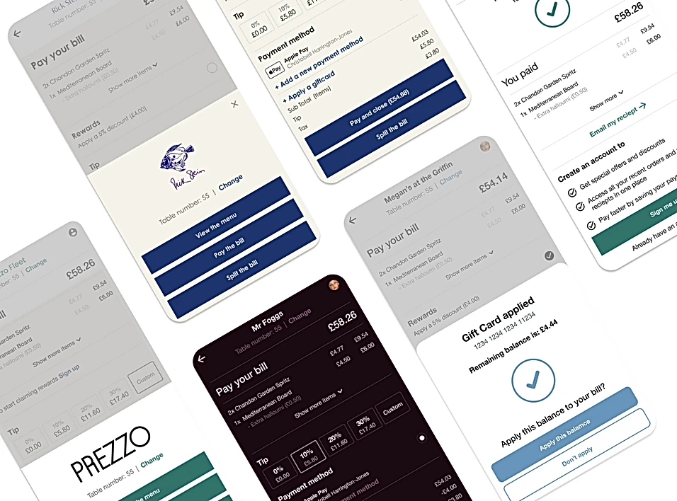
Improved visual hierarchy, introducing emphasis on the content that mattered most
Gave users the ability to clearly see their bill total (strategically placed at the top of the screen rather than the bottom)
Providing users with a variety of ways to pay (pay total or split bill) without needing to tap anything
A cleaner and easier way to include tips
Hiding the gift card input field (unless required)
A neater way to apply awards for registered users
Usability Testing
I walked Rick Stein through a demo of the prototype (Figma) and they loved it. They adopted the new feature as soon as we launched - to offer customers flexible digital ordering and payment experiences that would suit their service model.
Results
Rick Stein: 66K+ active users since launch
OverUnder: 20% increase in orders per month
Increased speed of service (with several merchants by up to 60%)
Halved the previously 'tap heavy' user journey
Usage increases across all merchants
Increased checkout conversions averaging 40%
Multipart ordering also helped drive usage, this feature is now used extensively
decreased churn (merchants)
delighted our end-users with a shiny new UI
Improved locations picker
The Problem
Launching the MVP of our web app (back in 2020) in a hurry came at a price. The UX consisted of a number of pain points on both web and order to table app:
Issues with diners ordering to the wrong location (but the correct table)
Painfully long check out process, too many screens to go through
Long loading speeds and time outs
Outdated UI
Unhelpful errors
Asking users to add a credit card before they can even browse the menu
No split the bill capabilities
Effected merchants:

Team
1 Designer (me)CPO
1 Product Owner
1 IOS Developer
1 Android Developer
2 Platform Engineers
Research
Speaking with merchants directly (ie. 'Head office' of Peach pubs) to understand pain points
In-customer/end-user visits, visiting around 32 customer venues around the UK
Competitor venues visits: how were they dealing with the same challenges?
Fleshing out all our existing task flows, this allowed us to see just how 'tap heavy' our UX really was
Remote User testing; split testing our solution with our competitors using the System Usability Scale (our starting score was 42, last score recorded was 80)
Reducing the customer journey by half for a new happy path: Working closely with CPO over the course of 3 sessions (1.5 hours) we cut down the user journey by half. Binning all the U-turns and pointless screens. I also removed lots of unnecessary content, while ensuring the UX was as easy as possible to navigate

Design Decisions
Based on the research findings, the following design decisions were made:
Improved visual hierarchy, introducing emphasis on the content that mattered most
Gave users the ability to clearly see their bill total (strategically placed at the top of the screen rather than the bottom)
Providing users with a variety of ways to pay (pay total or split bill) without needing to tap anything
A cleaner and easier way to include tips
Hiding the gift card input field (unless required)
A neater way to apply awards for registered users

Usability Testing
I walked Rick Stein through a demo of the prototype (Figma) and they loved it. They adopted the new feature as soon as we launched - to offer customers flexible digital ordering and payment experiences that would suit their service model.
Results
Rick Stein: 66K+ active users since launch
OverUnder: 20% increase in orders per month
Increased speed of service (with several merchants by up to 60%)
Halved the previously 'tap heavy' user journey
Usage increases across all merchants
Increased checkout conversions averaging 40%
Multipart ordering also helped drive usage, this feature is now used extensively
decreased churn (merchants)
delighted our end-users with a shiny new UI
Improved locations picker
The Problem
Launching the MVP of our web app (back in 2020) in a hurry came at a price. The UX consisted of a number of pain points on both web and order to table app:
Issues with diners ordering to the wrong location (but the correct table)
Painfully long check out process, too many screens to go through
Long loading speeds and time outs
Outdated UI
Unhelpful errors
Asking users to add a credit card before they can even browse the menu
No split the bill capabilities
Effected merchants:

Team
1 Designer (me)CPO
1 Product Owner
1 IOS Developer
1 Android Developer
2 Platform Engineers
Research
Speaking with merchants directly (ie. 'Head office' of Peach pubs) to understand pain points
In-customer/end-user visits, visiting around 32 customer venues around the UK
Competitor venues visits: how were they dealing with the same challenges?
Fleshing out all our existing task flows, this allowed us to see just how 'tap heavy' our UX really was
Remote User testing; split testing our solution with our competitors using the System Usability Scale (our starting score was 42, last score recorded was 80)
Reducing the customer journey by half for a new happy path: Working closely with CPO over the course of 3 sessions (1.5 hours) we cut down the user journey by half. Binning all the U-turns and pointless screens. I also removed lots of unnecessary content, while ensuring the UX was as easy as possible to navigate

Design Decisions
Based on the research findings, the following design decisions were made:
Improved visual hierarchy, introducing emphasis on the content that mattered most
Gave users the ability to clearly see their bill total (strategically placed at the top of the screen rather than the bottom)
Providing users with a variety of ways to pay (pay total or split bill) without needing to tap anything
A cleaner and easier way to include tips
Hiding the gift card input field (unless required)
A neater way to apply awards for registered users

Usability Testing
I walked Rick Stein through a demo of the prototype (Figma) and they loved it. They adopted the new feature as soon as we launched - to offer customers flexible digital ordering and payment experiences that would suit their service model.
Results
Rick Stein: 66K+ active users since launch
OverUnder: 20% increase in orders per month
Increased speed of service (with several merchants by up to 60%)
Halved the previously 'tap heavy' user journey
Usage increases across all merchants
Increased checkout conversions averaging 40%
Multipart ordering also helped drive usage, this feature is now used extensively
decreased churn (merchants)
delighted our end-users with a shiny new UI
Improved locations picker